
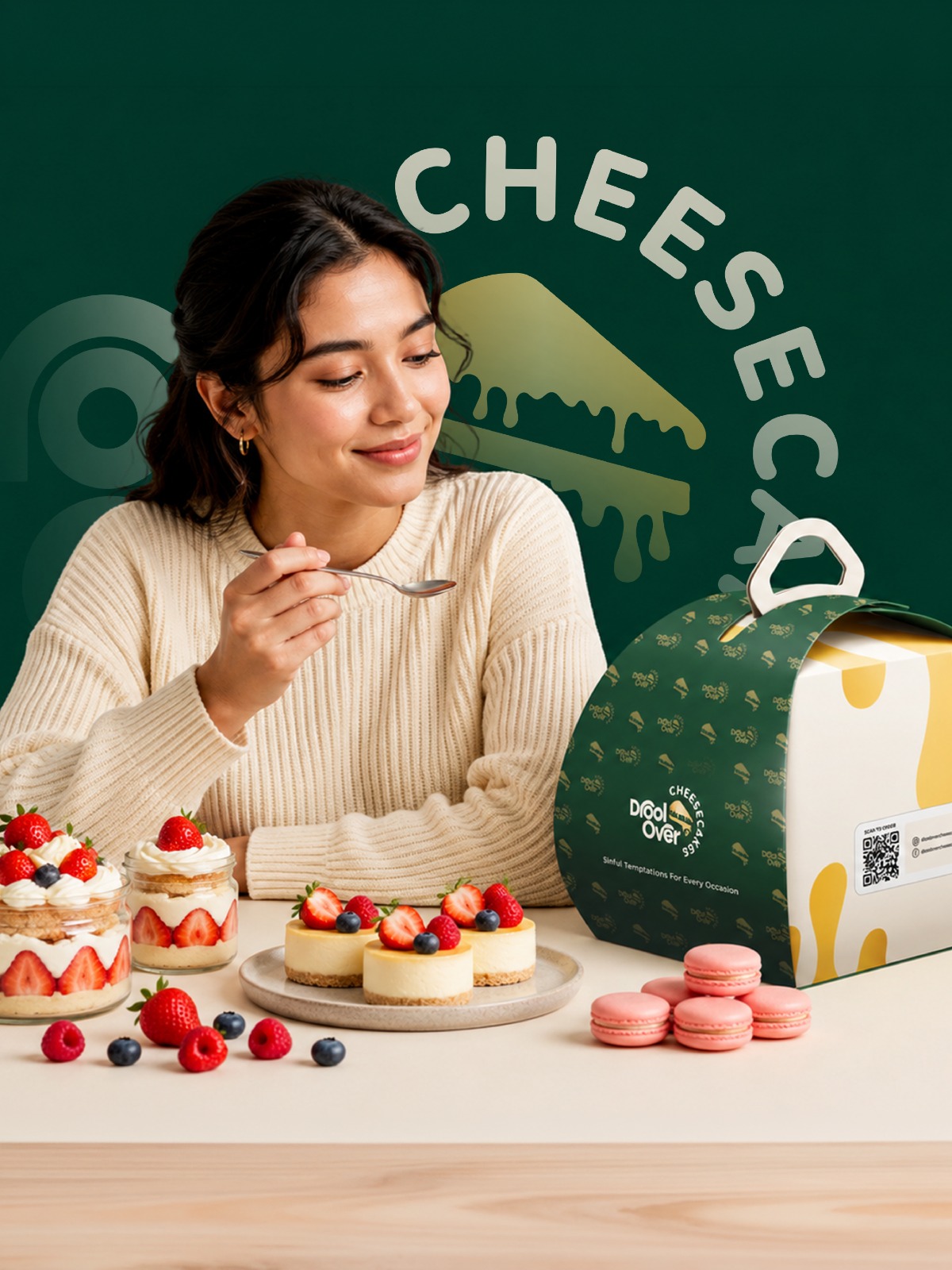
Some brands begin with a business plan. Others begin with a passion. Drool Over Cheesecakes belongs to the second kind.
The founders began their baking journey in 2018, working from a home kitchen and developing their craft around one simple idea: creating cheesecakes that people genuinely loved eating. Over time the cheesecakes became part of birthdays, celebrations, gifting, family moments and everyday cravings. The product was developing its own following.
But as the business grew, the brand needed to grow with it. A good product alone was no longer enough. Drool Over Cheesecakes needed an identity customers could recognise, remember and emotionally connect with. That is where Ragi entered the journey.
Instead of the predictable pink, brown or bright bakery palette, we built a more distinctive visual environment.
Deep green gives the brand confidence, sophistication and depth, and sets it apart from conventional dessert branding. Cream and dessert-inspired neutrals connect the identity with cheesecake, dairy, softness and indulgence, and give the green room to breathe. Refined gold accents were introduced carefully, as an accent rather than decoration, adding a subtle premium quality.
Together, the palette establishes a visual world that feels contemporary today and stays relevant as the brand grows.
When we started working with Drool Over Cheesecakes in December 2023, the objective was not simply to design a beautiful logo. The bigger challenge was: how do we visually translate the experience of eating a premium cheesecake into a brand?
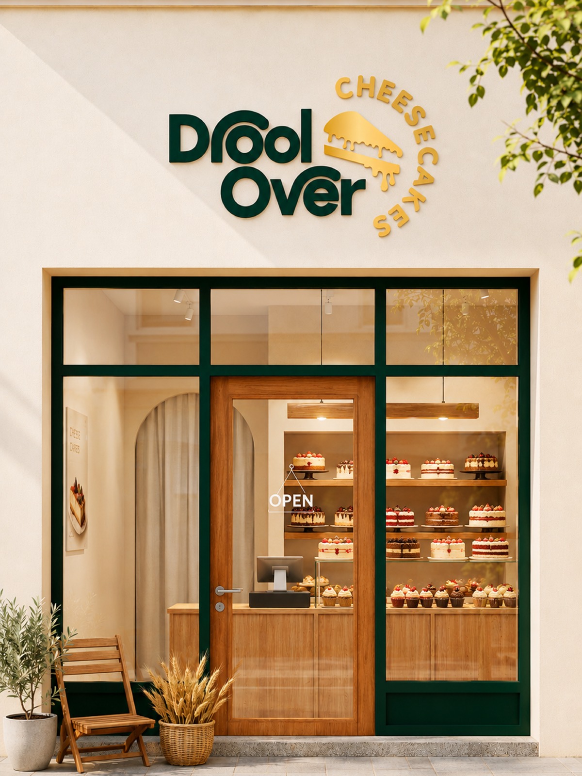
The identity had to feel delicious without becoming childish. Premium without becoming inaccessible. Modern without becoming generic. Playful without losing sophistication. And most importantly, it needed enough flexibility to work everywhere, from a small sticker on a cheesecake box to menus, takeaway bags, social media and eventually a physical café environment.
This meant we were not designing an isolated logo. We were designing a complete visual system.
Food branding begins with understanding the food. Cheesecake is fundamentally an indulgence product. People rarely buy cheesecake because they need it. They buy it to celebrate, reward themselves, surprise someone, satisfy a craving or make an ordinary moment feel special.
That distinction shaped our creative direction. Instead of positioning Drool Over Cheesecakes as another bakery, we wanted the identity to communicate an emotional experience: craving, indulgence, celebration, premium taste. The brand had to make someone want the cheesecake before they had tasted it.
We developed the visual direction around a simple idea: make cheesecake feel irresistible. The identity needed to sit comfortably between an artisanal dessert brand and a contemporary premium café.
Four characteristics guided every decision. Premium, because the product deserved a sophisticated presentation. Warm, because desserts are deeply connected with happiness and celebration. Memorable, because customers should recognise the brand quickly. Scalable, because the identity needed to keep working as the business expanded.
Rather than jumping to a finished mark, we explored different ways of representing the personality of Drool Over Cheesecakes: typography, symbols, dessert cues, cheesecake forms, proportions, and how the identity would behave across applications.
The final direction moved toward a cleaner, more sophisticated visual language. Cheesecake-inspired iconography creates an immediate relationship with the category, while the typography gives the identity a recognisable personality of its own. The objective was simplicity with character.
Instead of the predictable pink, brown or bright bakery palette, we built a more distinctive visual environment.
Deep green gives the brand confidence, sophistication and depth, and sets it apart from conventional dessert branding. Cream and dessert-inspired neutrals connect the identity with cheesecake, dairy, softness and indulgence, and give the green room to breathe. Refined gold accents were introduced carefully, as an accent rather than decoration, adding a subtle premium quality.
Together, the palette establishes a visual world that feels contemporary today and stays relevant as the brand grows.
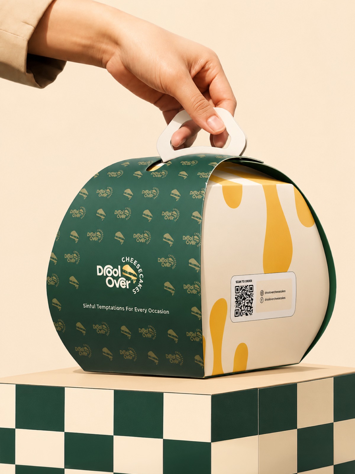
For a delivery-driven dessert business, packaging is the storefront that arrives at the customer's home. A customer may never meet the baker or visit the café. Their first physical interaction with the brand could be receiving a cheesecake box.
We developed a packaging language that extends the identity beyond the logo, so customers recognise the brand before reading its name. Colours, graphic elements, typography and spacing work together across cheesecake boxes, takeaway packaging, stickers and labels, carrier bags, menus, flyers and other touchpoints. Every piece belongs to the same family.
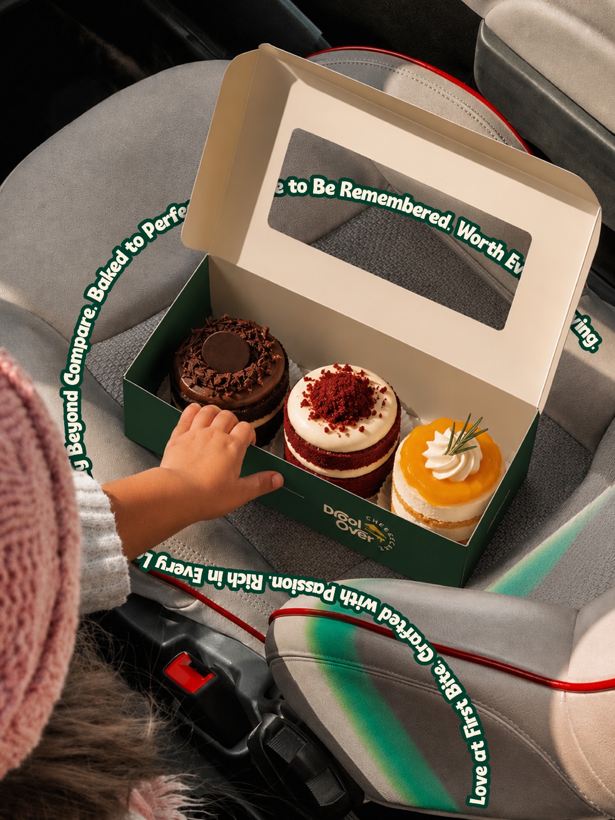
Food packaging has two jobs. The first is functional: protect the product. The second is emotional: create anticipation. Customers photograph the box, carry the bag, share celebrations on Instagram and give the product as a gift. Good packaging becomes advertising customers willingly carry. Our approach was to make it distinctive enough to be remembered, and controlled enough that the cheesecake remains the hero.
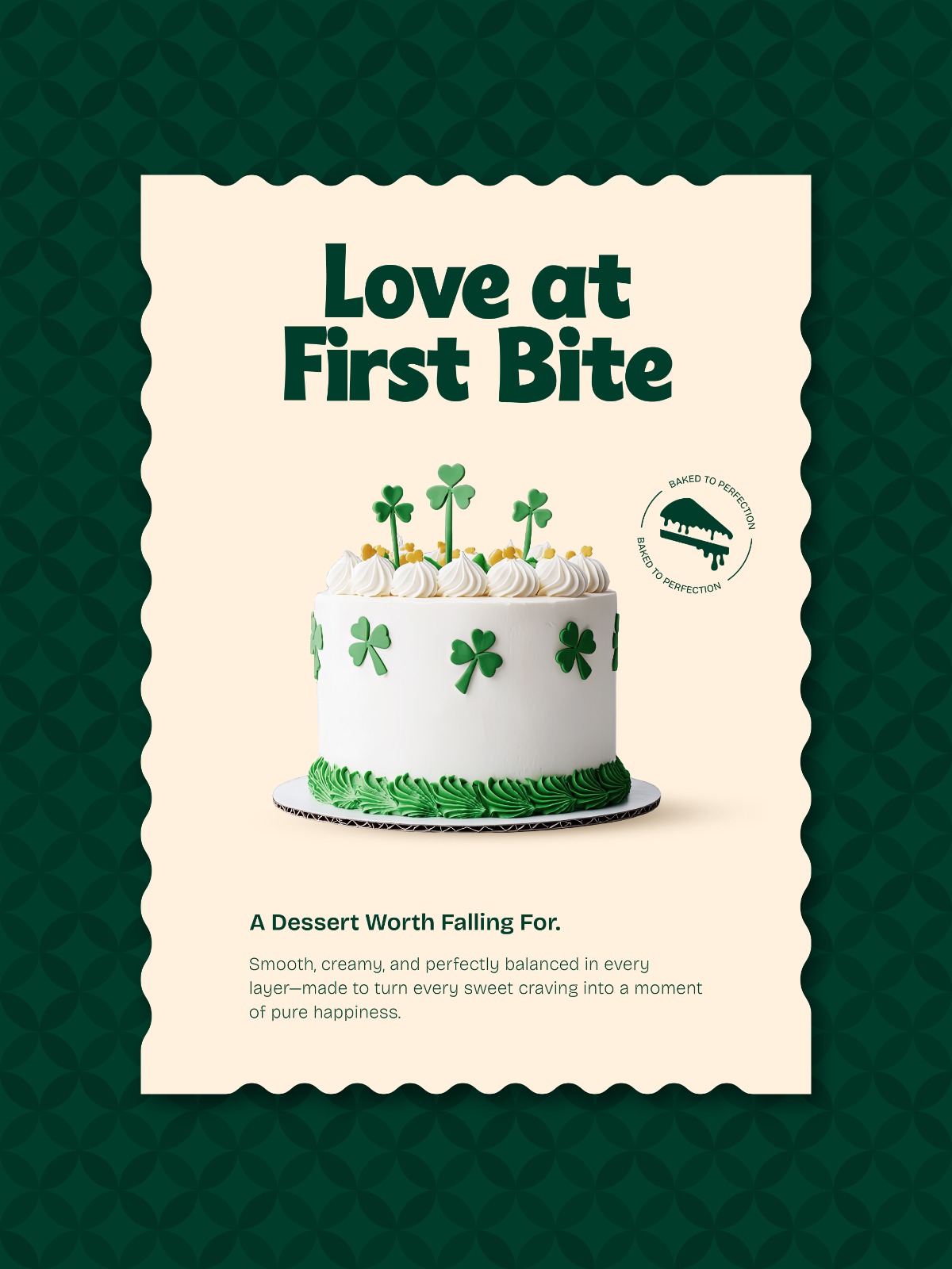
A brand becomes powerful when customers repeatedly encounter the same personality across touchpoints. So the project expanded beyond logo and packaging into menu design, print communication, the takeaway experience and a digital visual system for social media that communicates products, offers, occasions and personality consistently.
Communication also needed a voice. Instead of treating social media as a catalogue of cheesecake photographs, we built ideas around emotions and situations: Win Hearts with Cheesecake. Blushing with Flavor. Life's Sweet Decisions. Love, birthdays, friendships, celebrations, cravings, gifting, weekend indulgence. Once a food brand becomes connected with occasions, its communication becomes far stronger than product advertising.
Drool Over Cheesecakes has grown into a highly rated Bengaluru dessert destination. Its Google listing shows a 4.9 out of 5 rating from more than 200 customer reviews, with customers frequently mentioning flavours, presentation and experience. Popular favourites include blueberry, coconut, mango, Biscoff and chocolate cheesecakes.
What began as a home-based baking passion is now a recognisable, customer-facing dessert business. Seeing the identity functioning in the real market is the most meaningful outcome of the project.
Great branding takes time. Strong identities evolve through exploration, feedback and refinement, not one quick decision.
Packaging builds brand memory. When it is distinctive and consistent, every delivery becomes another moment of recognition.
Food branding must create emotion. Customers can see a cheesecake. Great branding helps them imagine how it will feel to eat it.
Consistency creates recognition, and branding must be designed for growth. Today's homegrown business could become tomorrow's multi-location brand, so the system has to work beyond the immediate requirement.


